Paint Colour Tinting
colour matching
Colour is known to affect our moods and emotions, so it makes sense to rely on color as a key element in your painting for conveying meaning or depicting an atmosphere. But color selection is an important process. You want the colours you are using to work well together, and it can be confusing at first to know how many colours to use and which ones work together. Understanding colour theory is an excellent way to simplify those decisions, and I’m here to help you by breaking down the basics of color theory in painting so you can progress to using our range of colours in the colourbook.
A WORD ABOUT THE COLOUR WHEEL
The first colour wheel was made by Isaac Newton in the 17th century. Using a prism to decompose white sunlight into the colours of the spectrum, he then joined the two ends of the spectrum to form the wheel.
The colour wheel used by artists today is the RYB colour wheel (red, yellow and blue). It is a subtractive color wheel, which means that colours become darker when mixed. With an additive colour wheel, colours made by a light source would get lighter as you mix them. The best example of this is on a computer screen.
Depending on the complexity of the colour wheel, you will find a different number of colours. However, the simplest colour wheels have 12 colours:
- The three primaries: That means colours that can’t be obtained by mixing other colours, all other colours on the wheel can be mixed from these three primaries.
- The three secondary colours: These are obtained by mixing two of the primary colours
- The six tertiary colours: Such colours are obtained by mixing two secondary colours contiguous on the wheel. That is, a tertiary colour is obtained by mixing two secondary colours or one primary and one secondary colour.
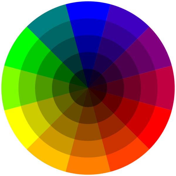
Every individual colour on the Basic Colour Wheel can be altered in three ways by Tinting, Shading or Toning. And that’s before we even think about mixing two colors together.
Let’s start with Lightening the twelve basic colors to create Tints.
A Tint is sometimes called a Pastel. Basically, it’s simply any color with white added.
If you want to get a little more complicated, you can mix any of the twelve pure colors together. Then simply add any amount of white and you have created a pastel or tint of the mixture.
That means you can go from an extremely pale, nearly white to a barely tinted pure hue. Artists often add a tiny touch of white to a pure pigment to give the color somebody. So, for example, a bright Red can quickly become a bright Pink.
A color scheme using Tints is usually soft, youthful and soothing, especially the lighter versions. All tints work well in in feminine environments. You often see advertising, marketing and websites use pale and hot pastels if they are targeting women as a demographic. In painting, you might save your lightest pastels for the focal point or use pastels for the entire painting.
Shades

So now that you know how to lighten, what’s the easiest way to make your colors darker?
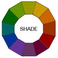
A Shade is simply any colour with black added.
Just as with making tints, you can mix any of the twelve pure colours together. Then simply add any amount of black and you have created a shade of the mixture.
That means you can go from an extremely dark, nearly black to a barely shaded pure hue.
Most artists use black sparingly because it can quickly destroy your main color. Some artists prefer not to use it at all. Instead, they understand the rules of colour well enough to make their own black mixtures.
Shades are deep, powerful and mysterious. Be careful not to use too much black as it can get a little overpowering. These darks work well in a masculine environment. They are best used as dark accents in art and marketing graphics.
Tones

Now that you understand how to lighten and darken your twelve colors how do you tone them down?
Almost every color we see in our day-to-day world has been one either a little or a lot. This makes for more appealing color combinations.
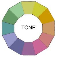
A Tone is created by adding both White and Black which is gray. Any color that is “grayed down” is considered a Tone.
Tones are somehow more pleasing to the eye. They are more complex, subtle and sophisticated.
Artists usually mix a little gray in every paint mixture to adjust the value and intensity of their pigment. Tones are the best choice for most interior decorating because they’re more interesting. They work well in any Color Scheme you might plan
